UX Design
The UX designs, UI flows, and storyboards created by Bailey Kalesti.
UX DESIGN
I care about great designs that help people achieve their goals. Considering and building bespoke designs for gameplay is something that’s incredibly rewarding for me! Below are examples of the wireframes, UI flows, storyboards, and improvements to existing UIs I’ve made for console games, pc games, mobile games, commercials, and short films.
WIREFRAMES
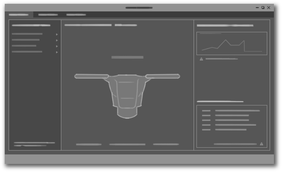
Wireframes are where a lot of cheap, highly iterative experimentation takes place long before I ever reach for my art tools. I’ve wireframed and coalesced gameplay needs for almost every game I’ve worked on. However, I’ve only been the sole UX designer for 3 larger projects in my career. In these cases I was responsible for every aspect of the design process…and ultimately the player experience. That said, this work is always a team effort. I couldn’t make UI without a supportive team!
This image shows some art process too, but I use it here to show the sheer number of UX iterations I go through for a full game.
UI FLOWS
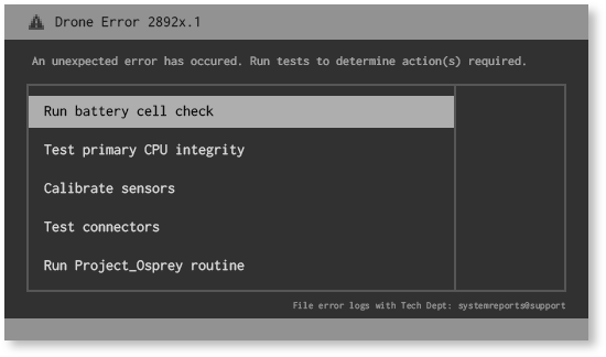
As mentioned above, I have been the sole UX designer for 3 different games. A console/tablet game, a mobile game, and a console/PC game. Below are a few examples of the flows I created for these titles.
STORYBOARDS & ANIMATICS
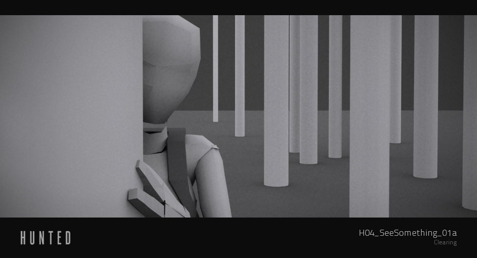
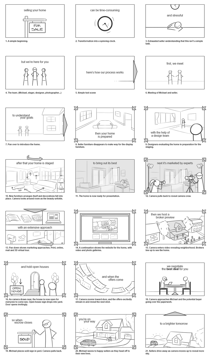
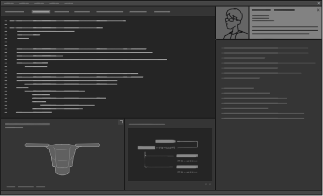
As a motion designer and film maker, I’ve done my share of storyboards and animatics. I think of these as wireframes for the time-based mediums.
IMPROVMENTS TO EXISTING UIs
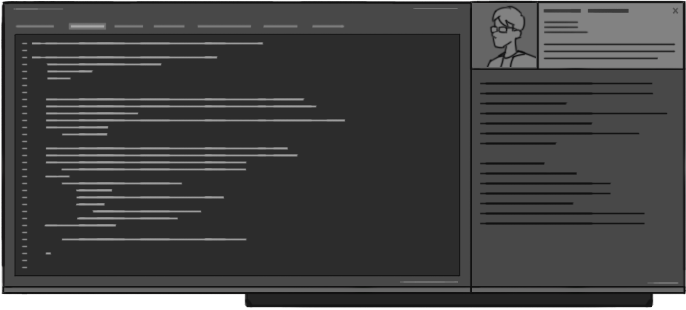
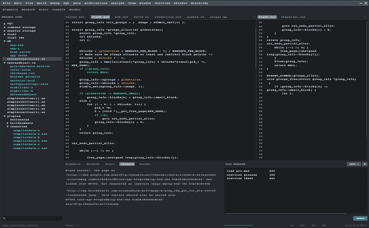
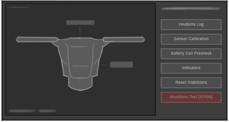
I have improved the designs for existing game screens for a few different projects. In these cases I tightened up the aesthetic and readability aspects, but I also added new functionality, moved things around, and sought to improve the holistic experience for players.
General Visual Design
Clarity is one of my most treasured design principles. Good player interaction and player experience sit upon this foundation. If a design isn’t well-ordered, it can’t be parsed in a reasonable timeframe and renders the design nearly useless. As a designer, I think about player experience at all times.
I created a poster many years ago that summed up my process. Notice most of these are about UX. In my opinion, beauty is one of the least important aspects of a good design (relatively!). I say this as a diehard artist who lives and breathes for aesthetics. But I know, to my very core, that a great experience comes first.
Below are a few more examples showing some of these principles at play. My hope is they show I care about clarity, eye trace, readability, and helping players (and in some cases viewers) find the information they need so they can have a great experience.
I was the both the UX and visual designer for this mobile game. It was released for iPhones and Androids.
Lastly I have my example from StartCraft II when I designed a brand new screen for War Chest. I had some wireframes to build on, but they were bare bones. I worked with my UX partner, Chris Reed, to develop a unique experience for a screen with a TON of information. UX design and UI art worked hand in hand to build something special. I’m very proud of what we did as a team.
And the process is outlined below: The Journey from Sketch to Final Design
Thanks for reading! 😊
I hope this helps show the range of experience I have crafting end-to-end experiences for players and viewers.
