Contact Us

Use the form on the right to contact us.

You can edit the text in this area, and change where the contact form on the right submits to, by entering edit mode using the modes on the bottom right. 


123 Street Avenue, City Town, 99999

(123) 555-6789

email@address.com


You can set your address, phone number, email and site description in the settings tab.
Link to read me page with more information.

HUNTED BLOG

Filtering by Category: Animatic

Simple Cameras

Bailey Kalesti

Cinematography is hard. In this case I'm trying to pull off a scene that has more movement and action than the other scenes. It's been a fun learning experience, but also tough.

When it comes to action scenes, I think it's pretty easy to get it wrong. And while I know I'm not the most experienced camera operator, it doesn't stop me from having some strong opinions on the matter. Specifically that scenes, no matter how intense they are, should be clear and understandable. A pet peeve of mine is the overuse of the shaky-cam effect. It decreases one's ability to perceive what is happening. Yes, camera noise can work at times, but only when it aids the story or a moment. When it's used right, it feels right. But it's rare.

In Hunted, I've been forcing myself to design a shot and then do as little with the camera as I can get away with. For instance, there is a scene where Chloe (protagonist) stares at something that is off-screen. However, the camera remains stock still. It's often tempting for me to put a little zoom on it for a dynamic feel. But I'm experimenting with stripping things down to the essentials, like a graphic designer would remove unnecessary shapes for a minimalist feel. Simplicity is so hard to pull off. I often refer to it as having the audacity to create something vulnerable.

Gray block out mesh of Chloe. Very simple stuff, but hopefully it delivers in the end.

Gray block out mesh of Chloe. Very simple stuff, but hopefully it delivers in the end.

Bailey

Finale Layout

Bailey Kalesti

This week saw a lot of work done on the finale. This is where our protagonist, Chloe, finds what she has been seeking. It's an important scene, and I feel like it's coming together fairly well. But, naturally, everything at this stage looks awful. Still, there are a few neat moments that I'm trying in earnest to pull off. Like how to keep the intensity of the segment going without sacrificing clarity. Some of my camera shots hold for a while; no quick cuts.

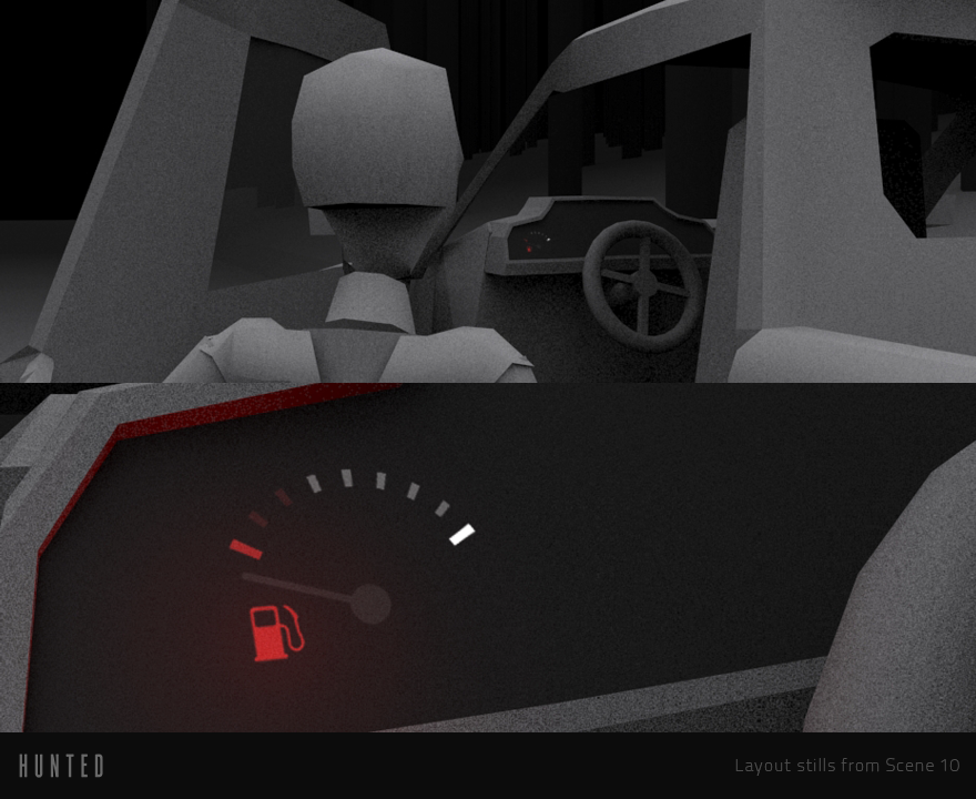
Here are a couple screenshots of what I've been up to. For those you don't know, layout looks awful as there is no real art in place. Its great purpose is to essentially lay the groundwork for the film.

Screenshot of my work set up. Can see rough animations and hierarchies here.

Screenshot of my work set up. Can see rough animations and hierarchies here.

Finale edits. Each piece is an animation chunk exported out from Max.

Finale edits. Each piece is an animation chunk exported out from Max.

I'm doing the proxy modeling, animation, and layout in 3ds Max. Then I'm importing captures into my timeline for editing. Even though I have the progression pretty well planned out, I'm still experimenting as I go. And sometimes my original ideas don't work as well as I hoped. So, I try different camera angles and stuff like that. It's a lot to keep track of. So many potential ways to go about this.

Different angles of an important piece of information. All work in progress.

Different angles of an important piece of information. All work in progress.

I will continue to do more layout this next week. Until Tuesday!

Bailey

3D Block Outs

Bailey Kalesti

Just thought I'd show some more of the progress on the animatic this week. For those of you less familiar with what these are, they're basically 3D storyboards. They're a super useful tool during development because they visualize a scene in a concrete way.

The important thing to remember, as always, is that this stuff is very rough. Actually, it's crap right now. None of the real visuals are present, just the framework for the visuals.

I did leave out the music so that you can enjoy it more later. But how much do you guys care about spoilers? I'm showing an awful lot of stuff, and I assume that if you're coming here, you want to know. But I just thought I'd ask. I'm willing to reveal more of the story, and I'd be able to show more of the art for those segments. Leave a comment below if you have a preference either way.

Next week expect to see some more 3D block outs. Not sure how interesting those are, but that's what I need to do next.

Bailey