Finale Layout
Bailey Kalesti
This week saw a lot of work done on the finale. This is where our protagonist, Chloe, finds what she has been seeking. It's an important scene, and I feel like it's coming together fairly well. But, naturally, everything at this stage looks awful. Still, there are a few neat moments that I'm trying in earnest to pull off. Like how to keep the intensity of the segment going without sacrificing clarity. Some of my camera shots hold for a while; no quick cuts.
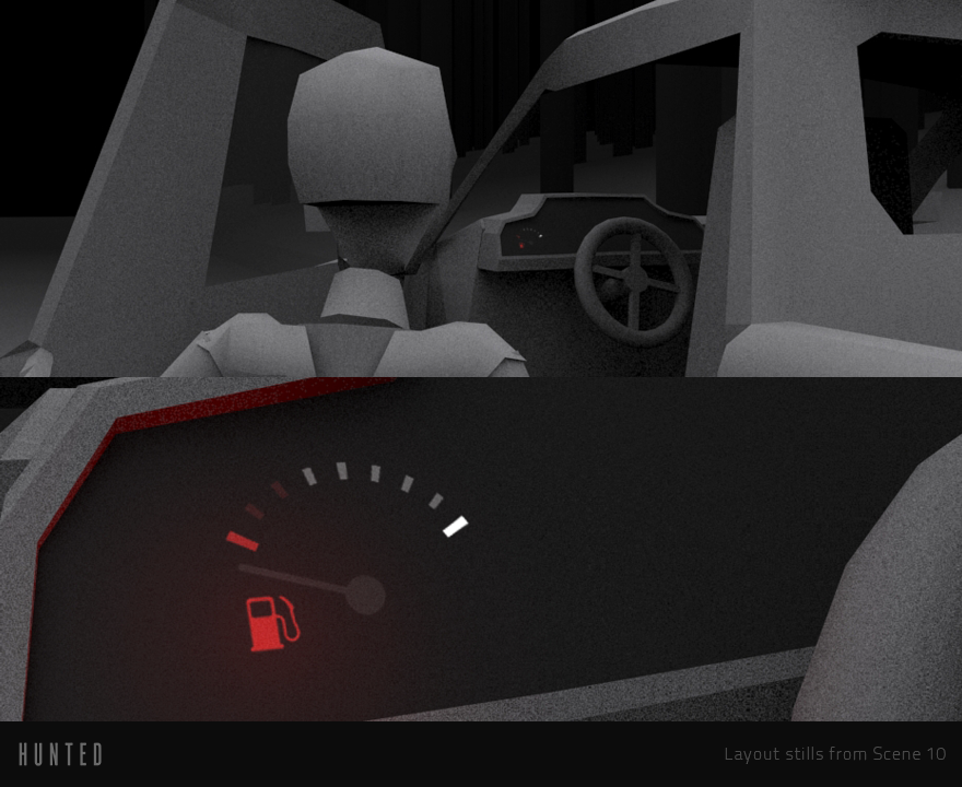
Here are a couple screenshots of what I've been up to. For those you don't know, layout looks awful as there is no real art in place. Its great purpose is to essentially lay the groundwork for the film.
Screenshot of my work set up. Can see rough animations and hierarchies here.
Finale edits. Each piece is an animation chunk exported out from Max.
I'm doing the proxy modeling, animation, and layout in 3ds Max. Then I'm importing captures into my timeline for editing. Even though I have the progression pretty well planned out, I'm still experimenting as I go. And sometimes my original ideas don't work as well as I hoped. So, I try different camera angles and stuff like that. It's a lot to keep track of. So many potential ways to go about this.
Different angles of an important piece of information. All work in progress.
I will continue to do more layout this next week. Until Tuesday!
Bailey


